Real Estate Photo Composition Rules That Make Every Room Look Better
Master the essential composition techniques for real estate photography, including the two-wall rule, one-point perspective, leading lines, and proper shooting height to make every room look spacious and inviting.
You can own the most expensive camera on the market, nail your exposure settings, and shoot during golden hour, but if your composition is off, the photo will still fall flat. Composition is the invisible framework that separates amateur snapshots from professional real estate imagery. It determines whether a room feels cramped or spacious, chaotic or inviting, forgettable or worth a second look.
The good news is that great composition in real estate photography follows a handful of repeatable rules. Unlike portrait or landscape photography, where creative rule-breaking is celebrated, interior and architectural photography rewards consistency and precision. Once you internalize these principles, you will apply them instinctively at every shoot.
This guide breaks down the composition rules that professional real estate photographers rely on daily. Whether you are shooting with a DSLR, a mirrorless body, or even an iPhone, these techniques will immediately improve the quality of your listing photos.
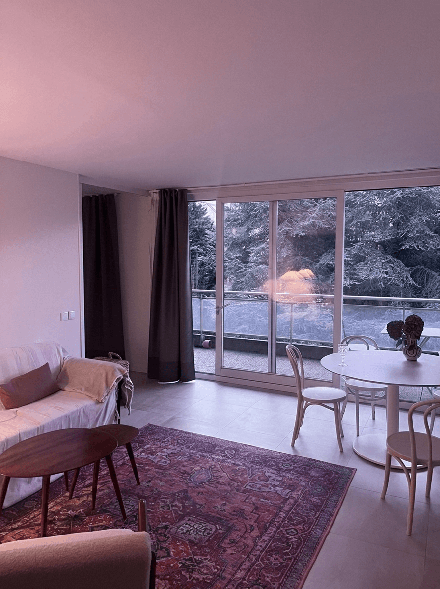
The Two-Wall Rule
The two-wall rule is the single most impactful composition technique in real estate photography. The concept is simple: frame your shot so that exactly two walls are visible. This creates a natural sense of depth and dimension that a single flat wall cannot achieve, while avoiding the distorted "fishbowl" look that comes from trying to capture three or four walls at once.
When you photograph a room showing only one wall straight on, the image reads as flat and two-dimensional. The viewer has no spatial reference for how deep the room is. Conversely, cramming three walls into a single frame requires an ultra-wide angle that warps furniture and makes doorways look like funhouse mirrors.
Two walls give the viewer just enough geometric information to mentally reconstruct the room's shape. The line where the two walls meet creates a natural vanishing point that pulls the eye into the image, making the space feel three-dimensional even on a flat screen.
How to Execute the Two-Wall Shot
- Stand in a corner of the room or just inside the doorway
- Angle your camera so one wall occupies roughly two-thirds of the frame and the second wall fills the remaining third
- Keep the vertical edges of the walls perfectly straight (more on this below)
- Include enough floor to ground the image and enough ceiling to show room height without wasting space
Pro Tip
When a room is too small to back into a corner, stand in the doorway and shoot diagonally across the room. This maximizes the visible floor space and naturally creates a two-wall composition without requiring a super-wide lens.
Corner Shots and Diagonal Compositions
Corner shots are a variation of the two-wall rule where you position yourself in or near a corner and shoot diagonally across the room. This technique is particularly effective for bedrooms, offices, and other smaller rooms where you want to convey maximum spaciousness.
The diagonal line from one corner to the opposite corner is the longest possible line through any rectangular room. By aligning your composition along this diagonal, you are literally photographing the room at its widest dimension. The psychological effect on the viewer is significant: the room reads as larger than it would in a straight-on shot.
When to Use Corner Shots
- Bedrooms where the bed dominates the floor plan and you need to show the full room around it
- Home offices that feel tight in reality but need to look workable in photos
- Bathrooms where shooting from the doorway straight on would show only the vanity or toilet
- Dining rooms where you want to emphasize the table length and surrounding space
For bright and airy photography styles, corner shots work especially well because the diagonal perspective allows more natural light to enter the frame from windows on both visible walls.
One-Point Perspective
One-point perspective is a powerful composition technique borrowed from architectural photography. In this approach, you align the camera so that all parallel lines in the room converge toward a single vanishing point, typically at the center of the frame. The result is a symmetrical, almost cinematic image that feels orderly and grand.
This technique works best in:
- Hallways and corridors where parallel walls create strong converging lines
- Kitchens shot from one end, looking down the counter line
- Master bathrooms with double vanities shot from the center
- Living rooms with a focal wall (fireplace, built-in shelving, accent wall)
Setting Up One-Point Perspective
- Stand at the exact center of the room, equidistant from both side walls
- Level your camera on the tripod so there is zero tilt
- Aim straight ahead so the far wall is centered in your viewfinder
- Check that the left and right edges of the frame show equal amounts of each side wall
- Fine-tune your position until vertical lines on both sides are equidistant from the frame edges
The precision required here is worth the effort. Even a few inches off-center will break the symmetry and make the image feel "wrong" to viewers, even if they cannot articulate why.
Leading Lines
Every room contains lines: countertop edges, floorboard seams, ceiling beams, furniture edges, window frames, and architectural trim. Leading lines are any of these visual elements that guide the viewer's eye through the image toward a focal point.
In real estate photography, effective use of leading lines serves two purposes. First, it directs attention to the room's best features, whether that is a marble island, a picture window, or a fireplace. Second, it creates a sense of movement and depth that makes static rooms feel dynamic.
Types of Leading Lines in Interiors
| Line Type | Where to Find It | Effect |
|---|---|---|
| Converging lines | Countertops, hallways, floorboards | Draws eye deep into the image |
| Diagonal lines | Staircase railings, angled furniture | Creates energy and dynamism |
| Curved lines | Archways, round furniture, curved walls | Softens composition, adds elegance |
| Horizontal lines | Shelving, wainscoting, window sills | Suggests stability and width |
| Vertical lines | Columns, tall windows, doorframes | Emphasizes height and grandeur |
The most effective real estate photos combine two or three types of leading lines. For example, a kitchen shot might use converging countertop lines to draw the eye toward a window (the focal point) while horizontal lines from the backsplash tiles add a sense of width.
Rule of Thirds for Interiors
The rule of thirds is photography's most well-known composition guideline. Divide your frame into a 3x3 grid and place key elements along the grid lines or at their intersections. In real estate photography, the rule of thirds applies differently than in portrait or landscape work.
How to Apply It
- Horizon placement: Position the floor-ceiling boundary on either the lower or upper third line. For rooms with beautiful flooring, place the boundary on the upper third to show more floor. For rooms with impressive ceiling details, place it on the lower third.
- Focal point placement: Position the room's hero feature (fireplace, island, window view) at one of the four intersection points rather than dead center.
- Vertical elements: Align doorways, columns, or other vertical features with the left or right third lines.
One important exception: as discussed above, one-point perspective shots deliberately break the rule of thirds by centering the vanishing point. This is intentional and works because the symmetry itself becomes the compositional strength.
Shooting Height: The Chest-Level Standard
One of the most common mistakes in real estate photography is shooting from eye level, roughly five to six feet off the ground. At this height, you are looking slightly down at countertops and furniture, which compresses the room vertically and emphasizes floors over the overall space.
The professional standard is to shoot at chest level, approximately four feet off the ground. This height achieves several things:
- Countertops and tables appear at a natural, inviting angle rather than being looked down upon
- The vertical proportion of walls is balanced, showing equal amounts of floor and ceiling
- Furniture is seen at a more flattering angle that shows its form rather than its top surface
- Windows are captured more fully, allowing more natural light into the frame
Exceptions to the Rule
- Bathrooms: Lower the camera to about 3.5 feet to properly frame vanities and show the tub
- Overhead kitchen shots: Some photographers raise to five feet for kitchen shots to show more of the countertop surface when it is a selling feature (granite, marble, butcher block)
- Staircase shots: Adjust height based on which level you want to emphasize
If you are shooting Airbnb listings, consistent shooting height across all rooms creates a cohesive visual flow that makes the entire listing feel professionally produced.
Quick Equipment Note
A tripod with a reversible center column makes height adjustment fast and repeatable. Mark your standard shooting height on the tripod legs with tape so you can set up identically in every room without measuring.
Vertical Alignment: Keeping Lines Straight
Nothing screams "amateur" louder than converging vertical lines in a real estate photo. When vertical elements like walls, doorframes, and columns lean inward or outward, the entire image looks unstable. This distortion happens when the camera is tilted up or down, even slightly.
How to Nail Vertical Alignment
- Use a bubble level or your camera's built-in electronic level
- Enable grid lines on your camera's LCD or viewfinder
- Shoot at chest height to minimize the need to tilt up or down
- Correct in post-processing using lens profile corrections and manual perspective adjustments
Wide-angle lenses exaggerate vertical convergence, so this issue becomes more pronounced at focal lengths below 20mm. If you are shooting at 16mm or wider, plan to spend time correcting verticals in editing.
With Twilight's AI editing tools, perspective and distortion corrections can be applied automatically as part of your editing workflow, saving time when processing large batches of listing photos.
Framing Within the Frame
Using architectural elements to create frames within your photograph adds layers of depth and directs attention to the subject. Doorways, archways, windows, and even furniture arrangements can serve as natural frames that make images more visually interesting.
Common Framing Techniques
- Doorway shots: Stand just outside a room and use the doorframe to create a border around the interior scene
- Window framing: Position yourself so a window frames an attractive exterior view
- Arch framing: Use archways between rooms to create elegant transitions
- Furniture framing: Use a foreground element like the edge of a sofa or dining chair to create depth
The doorway shot is particularly useful for avoiding common mistakes in Airbnb photography. It gives viewers a sense of moving through the space, which creates an emotional connection to the property.
Minimizing Clutter in Your Composition
Composition is not just about what you include in the frame; it is equally about what you exclude. Every object in the image either supports the story of a desirable living space or detracts from it.
The Pre-Shoot Declutter Checklist
Before composing any shot, scan the room for these common distractions:
- Personal items: Family photos, medication, toiletries, children's artwork on the fridge
- Small appliances: Toasters, coffee makers, knife blocks (unless staging a "lifestyle" kitchen shot)
- Cords and cables: Power strips, charging cables, visible extension cords
- Trash cans: Remove from kitchens, bathrooms, and offices
- Reflections: Mirrors and glass surfaces that show you or your equipment
Once the room is clean, compose your shot to emphasize the room's best features while minimizing any remaining imperfections. Sometimes shifting your camera position six inches to the left hides a wall crack behind a doorframe. A small adjustment in angle might crop out a dated ceiling fan while keeping the rest of the room intact.
Quick-Reference Composition Checklist
Use this checklist at every shoot until these principles become second nature:
| Step | Check |
|---|---|
| 1 | Two walls visible in the frame |
| 2 | Camera at chest height (~4 feet) |
| 3 | Vertical lines are perfectly straight |
| 4 | Horizontal lines are level |
| 5 | Room's hero feature is on a rule-of-thirds intersection |
| 6 | Leading lines guide the eye toward the focal point |
| 7 | No personal items, clutter, or distracting reflections |
| 8 | Enough floor visible to ground the image |
| 9 | Enough ceiling to show room height without wasted space |
| 10 | No lens distortion warping furniture or doorways |
Print this checklist and tape it to the back of your camera or keep it on your phone for quick reference during shoots.
Room-by-Room Composition Tips
While the rules above apply universally, each room type has specific composition considerations that are worth learning.
Living Rooms and Great Rooms
Living rooms are typically the largest interior spaces and offer the most compositional flexibility. Shoot from the corner opposite the room's main feature, whether that is a fireplace, media wall, or large window. Show the flow between the living area and adjacent spaces like dining rooms or kitchens to emphasize open floor plans.
Kitchens
Kitchens benefit from compositions that emphasize counter space and storage. The classic kitchen shot positions the camera at the end of the island or peninsula, using the countertop as a strong leading line. Always include the backsplash, as it is a feature buyers actively evaluate. If the kitchen opens to a dining or living area, include a sliver of that space to communicate the floor plan.
Bedrooms
Bedrooms are the rooms where photographers most often struggle with composition because the bed dominates the floor plan. Shoot diagonally from a corner to maximize the visible floor space around the bed. Include the window to show natural light. If the room has a notable feature like a vaulted ceiling, built-in closet system, or an ensuite doorway, position your composition to include it.
Bathrooms
Bathrooms require the most careful composition because they are small and full of reflective surfaces. Shoot from the doorway or just inside it, using the doorframe for natural framing. Keep the toilet out of the hero shot when possible; focus on the vanity, shower, or tub as the subject. Lower your camera to about 3.5 feet to properly frame bathroom fixtures.
Hallways and Staircases
Hallways are perfect opportunities for one-point perspective. Center yourself and let the converging walls pull the viewer through the space. For staircases, shoot from the bottom looking up to emphasize height, or from a landing looking down to show the entry below. Staircases offer some of the most dramatic leading lines in residential architecture.
Combining Composition With Post-Processing
Even the best-composed photos benefit from editing. Composition gets you 80% of the way to a great image, but the final polish, including brightness, color balance, and sky enhancement, brings it the rest of the way.
When you shoot with strong composition fundamentals, your editing becomes faster and more effective. A well-composed image needs less cropping, less perspective correction, and fewer distracting elements to clone out. This is especially true when using AI-powered editing tools like Twilight, where a clean starting composition allows the AI to focus on enhancement rather than correction.
The relationship between composition and editing is symbiotic. A perfectly composed photo with dull lighting and a gray sky through the window still needs editing to shine. And a poorly composed photo cannot be fully rescued by even the most advanced AI tools. Cropping can tighten a loose composition, but it cannot add walls that were never in the frame or change the fundamental perspective of the shot.
If you are looking to streamline your entire editing workflow after nailing your compositions, check out our guide on how to edit real estate photos with AI for a complete walkthrough.
Putting It All Together
The composition rules covered in this guide are not theoretical. They are the exact techniques used by working real estate photographers who shoot dozens of properties every week. The two-wall rule, proper shooting height, vertical alignment, and strategic use of leading lines are the foundation of every great listing photo.
Start by focusing on just one or two rules per shoot. Master the two-wall rule first, since it has the biggest impact on perceived room size. Then add proper shooting height. Then work on leading lines and the rule of thirds. Within a few shoots, these techniques will become automatic, and the quality difference in your listing photos will be unmistakable.
Remember that composition is a skill, not a talent. Every professional real estate photographer learned these techniques through deliberate practice. The photographers whose work you admire on top listings did not start out with an innate sense of framing. They studied the rules, applied them repeatedly, and refined their eye over hundreds of shoots.
Great composition paired with professional editing creates listing photos that stop the scroll, generate more clicks, and ultimately help properties sell faster and for more money. That is not just good photography. That is good business.
Related Articles
Bright and Airy Real Estate Photography: Tips and Techniques
Master the bright and airy photography style that dominates real estate marketing. Learn camera settings, natural light techniques, editing tips, and how AI presets can achieve this look instantly.
Color Correction for Real Estate Photos: Fix Mixed Lighting, Yellow Casts, and More
Learn how to fix color casts, white balance issues, and mixed lighting in real estate photos. Covers Kelvin temperature basics, common lighting problems, and AI-powered color correction workflows.
Photographing Airbnb Kitchens and Bathrooms: The Rooms That Seal the Deal
Kitchens and bathrooms are where Airbnb guests judge cleanliness and quality. Master the photography techniques that make these spaces shine.