White Balance and Color Correction for Real Estate Photos: Fix Bad Lighting Fast
Fix yellow casts, mixed lighting, and color issues in real estate photos. Learn manual and AI techniques for accurate, appealing color in listings.
Walk into almost any home and your eyes automatically adjust to the lighting. The warm glow of incandescent bulbs, the greenish tint of old fluorescents, the cool blue of daylight through windows --- your brain filters all of this out and shows you "normal" colors. Your camera does not have that luxury.
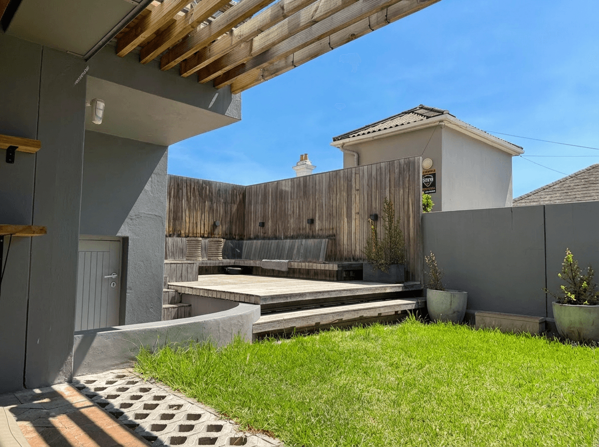
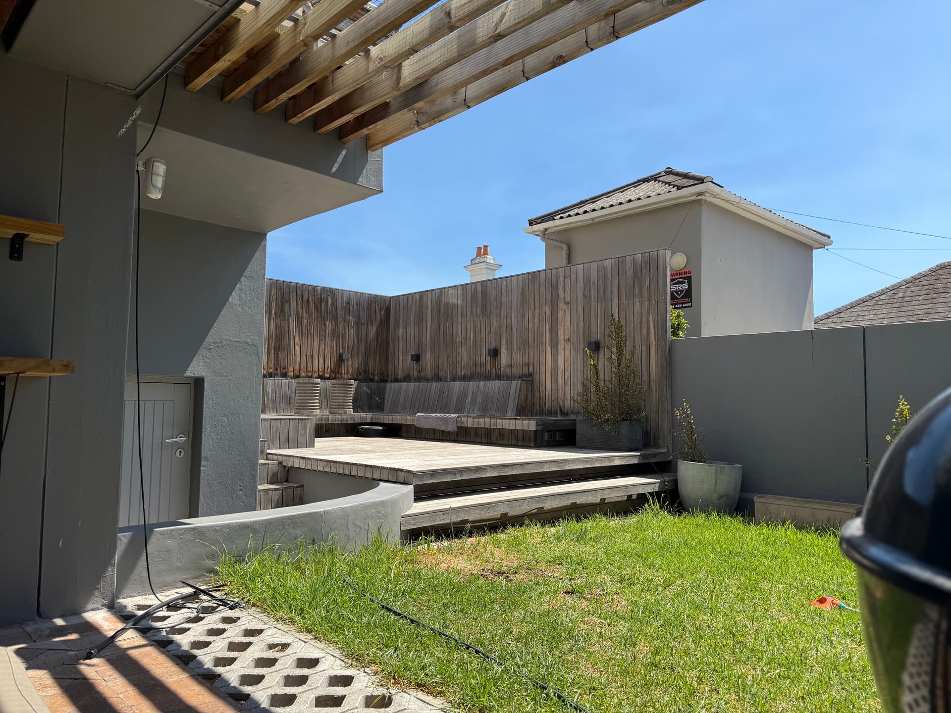
Incorrect white balance and color casts are among the most common problems in real estate photography, and among the most damaging. A yellow-orange cast makes rooms look dated and dingy. A green tint makes spaces feel institutional. Mixed lighting creates patches of different color temperatures that look chaotic and unprofessional. In this tutorial, we break down why color problems happen, how to fix them manually, and how AI makes accurate color correction effortless.
Why Color Accuracy Matters in Real Estate
Color problems in listing photos create several specific issues that directly affect buyer perception and listing performance.
Buyer Expectations
Buyers expect listing photos to accurately represent the property. When they walk into a home that looks different from the photos --- warmer, cooler, or a different color scheme entirely --- it creates a disconnect that undermines trust. While a little enhancement is expected and accepted, dramatic color inaccuracy can feel misleading.
Perceived Condition
Color casts change how buyers perceive the condition of a property. A yellow-orange cast makes white walls look stained or dirty. It makes countertops look aged. It makes bathrooms look unhygienic. The property might be immaculate, but the color cast tells a different story.
Emotional Response
Color psychology is well-documented in real estate marketing. Cool, neutral tones convey cleanliness and modernity. Warm, balanced tones convey comfort and welcome. But an uncontrolled yellow cast does not feel "warm" --- it feels wrong. And a blue-green cast does not feel "modern" --- it feels cold and sterile. Accurate color allows the property's actual characteristics to drive the emotional response.
Legal and Ethical Considerations
While not a legal requirement in most jurisdictions, accurate color representation is considered a best practice by real estate boards and professional photographer associations. Dramatically misrepresenting the color of walls, floors, or fixtures through editing crosses an ethical line.
Common Color Problems in Property Photos
Understanding the types of color problems helps you identify and fix them faster.
Yellow/Orange Cast
Cause: Incandescent or warm LED bulbs (2700-3000K color temperature). This is the single most common color problem in real estate photos because most homes have warm-toned lighting.
Appearance: White walls look cream or yellow. White ceilings have an amber tone. Countertops and fixtures look warmer than they are.
Severity: High. Yellow-tinted interiors are the number one photo quality complaint from listing agents.
Green Cast
Cause: Fluorescent lighting (common in kitchens, garages, basements, and older offices) or certain LED panels.
Appearance: Skin tones look sickly. White surfaces have a subtle green or mint tint. The overall image feels institutional.
Severity: Medium. Less common than yellow but more noticeable and harder to fix manually.
Blue/Cool Cast
Cause: Overcast daylight through large windows, shade, or cool LED bulbs (5000K+). Also common when the camera's auto white balance overcompensates for warm interior light.
Appearance: Rooms feel cold and sterile. Wood tones lose their warmth. The space feels uninviting.
Severity: Medium. Blue casts are less common than yellow but can make otherwise warm, inviting spaces feel impersonal.
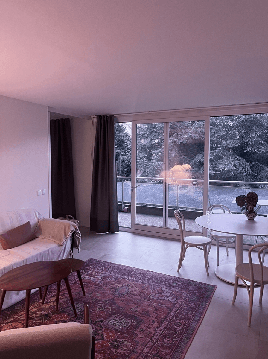
Mixed Lighting (The Worst Offender)
Cause: Multiple light sources with different color temperatures in the same room --- daylight from windows (5500K), incandescent lamps (2700K), and fluorescent overheads (4100K) all competing.
Appearance: Different areas of the same photo have different color casts. The wall near the window looks blue-white while the wall near the lamp looks orange. The ceiling might be green from overhead fluorescents.
Severity: Very high. Mixed lighting is the hardest color problem to fix manually because there is no single white balance setting that works for the entire image.
The Kelvin Scale
Color temperature is measured in Kelvin (K). Candlelight is about 1800K (very warm/orange). Incandescent bulbs are 2700K. Daylight is 5500K. Overcast sky is 6500K. The higher the number, the cooler (bluer) the light. Your camera's white balance setting tells it what color temperature to expect, so it can compensate.
Understanding White Balance: The Basics
White balance is your camera's way of compensating for the color of the light source. When set correctly, white objects appear white, and all other colors are rendered accurately.
Auto White Balance (AWB)
Most cameras and smartphones default to Auto White Balance, which attempts to detect the light source and compensate automatically. AWB works reasonably well in simple lighting conditions --- outdoors in daylight, for example --- but frequently fails indoors, especially with mixed lighting.
Common AWB failures in real estate:
- Rooms lit primarily by warm bulbs: AWB partially compensates but usually leaves a noticeable yellow cast
- Mixed lighting: AWB averages the different light sources, resulting in no area being correctly balanced
- Rooms with colored walls: AWB can be confused by large areas of saturated color, compensating for the wall color instead of the light source
Manual White Balance Presets
Most cameras offer white balance presets for common lighting conditions:
| Preset | Target Temperature | Best For |
|---|---|---|
| Daylight / Sunny | ~5500K | Outdoor exteriors in sun |
| Cloudy | ~6500K | Overcast exteriors |
| Shade | ~7500K | Shaded areas |
| Tungsten | ~3200K | Rooms with warm bulbs |
| Fluorescent | ~4000K | Rooms with fluorescent lighting |
| Flash | ~5400K | Flash-lit interiors |
Custom White Balance
The most accurate method is setting a custom white balance using a gray card or white reference. You photograph the gray card under the room's lighting, then tell the camera to use that as a neutral reference. This is the gold standard for accuracy but requires an extra step in each room.
Manual Color Correction in Lightroom/Photoshop
If you edit manually, here is the step-by-step process for correcting color in a typical interior real estate photo.
Step 1: Set the White Balance (30-60 seconds)
In Lightroom's Develop module, use the White Balance Eyedropper tool. Click on something in the image that should be neutral --- a white wall, a gray countertop, a white ceiling. This sets the overall white balance for the image.
Step 2: Fine-Tune with Temperature and Tint Sliders (30-60 seconds)
The eyedropper gets you close, but you usually need to refine. Adjust the Temperature slider (yellow/blue axis) and the Tint slider (green/magenta axis) until whites look white and skin tones (if present) look natural.
Step 3: Address Mixed Lighting with Local Adjustments (2-5 minutes)
For rooms with mixed lighting, a single global white balance setting will not work. You need to use Lightroom's local adjustment tools (Graduated Filter, Radial Filter, or Adjustment Brush) to apply different color corrections to different areas of the image. This is tedious and time-consuming but necessary for accurate results.
Step 4: Check Accuracy (30 seconds)
Toggle the before/after view. Look at key reference points: white walls, white trim, countertops, and any known color references. If something still looks off, go back and adjust.
Total time per image: 3-8 minutes depending on the severity of the color problem and whether mixed lighting is involved.
For a listing with 25 interior photos, manual color correction alone can take 1-3 hours.
AI Color Correction: One-Click Solutions
AI color correction takes a fundamentally different approach to the problem. Instead of you manually identifying the color cast and adjusting sliders to compensate, the AI analyzes the entire image, identifies the light sources, and applies intelligent corrections that address even mixed lighting scenarios in a single pass.
How AI Color Correction Works
- Scene analysis: The AI identifies the type of room, the light sources, and areas that should be neutral (white walls, gray surfaces).
- Per-region correction: Unlike a global white balance adjustment, AI can correct different areas independently, warming the window-lit area while cooling the lamp-lit area.
- Semantic understanding: The AI knows that wood floors should look like wood, granite countertops should look like granite, and white cabinets should look white. It uses this understanding to guide color decisions.
- Natural preservation: Good AI color correction does not make images look sterile or over-processed. It preserves the natural warmth of a space while eliminating casts.

Speed Comparison
| Approach | Time per Image | Time for 25-Photo Listing |
|---|---|---|
| Manual (Lightroom) | 3-8 minutes | 1.25-3.3 hours |
| AI (Twilight) | 10-30 seconds | Under 5 minutes |
The speed difference is dramatic, but more importantly, AI color correction is more consistent. A human editor's color perception shifts throughout a long editing session (a phenomenon called chromatic adaptation). The AI applies the same objective standard to every image.
Room-by-Room Color Challenges
Different rooms in a home present different color correction challenges.
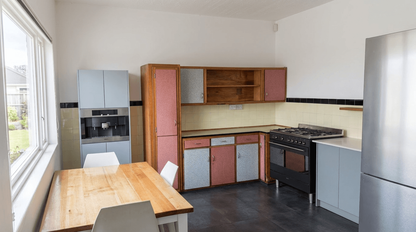
Kitchens
Typical problem: Mixed lighting from under-cabinet lights (warm), overhead recessed lights (warm or cool depending on bulbs), and window light (daylight). Stainless steel appliances can create reflective color contamination.
Strategy: Color correction should make white cabinets look white, countertops accurate, and stainless steel neutral. The Bright and Airy preset combined with color correction works exceptionally well for kitchens.
Bathrooms
Typical problem: Vanity lights (usually warm), small windows (limited daylight), and reflective surfaces (tile, mirrors, glass) that bounce colored light around the space. White tile is the most unforgiving surface for color casts.
Strategy: Bathrooms need the most aggressive color correction because the dominance of white surfaces makes any cast immediately obvious. AI excels here because it recognizes that bathroom tile and fixtures should be neutral.
Basements
Typical problem: Fluorescent overhead lighting (green cast), no windows (no daylight to balance), and often a mix of finished and unfinished areas with different lighting.
Strategy: Basements almost always need significant color correction. The lack of daylight means the camera's auto white balance has no neutral reference, leading to heavy casts. AI correction is particularly valuable here.
Living Rooms
Typical problem: The most mixed-lighting room in the house. Large windows (daylight), table lamps (warm), overhead fixtures (variable), and often a fireplace or TV adding additional light sources.
Strategy: Living rooms benefit from AI's per-region correction capability. The ability to balance the window-lit wall differently from the lamp-lit corner is what makes AI correction superior to a single global adjustment.
Shooting for Better Color: Prevention Tips
While AI can fix most color problems, starting with better source material always produces superior results.
Turn Off All Artificial Lights
Counterintuitive but effective: turning off all interior lights and relying only on natural window light eliminates mixed lighting entirely. The result is a consistent color temperature across the entire room. The photos may be darker (fix with brightness editing), but the color will be accurate.
Shoot in RAW
RAW files preserve all the color data your camera sensor captures, giving you (or the AI) maximum flexibility in post-processing. JPEG files bake in the camera's white balance decision, making it harder to correct later. If your camera supports RAW, use it for interiors.
Use Consistent LED Panels
Portable LED panels with adjustable color temperature (bi-color LEDs) let you add fill light that matches the ambient color temperature of the room. A single panel bounced off the ceiling can reduce mixed lighting problems dramatically.
White Balance Card
A small gray or white balance card, photographed in each room, gives you an accurate reference for post-processing. Even if you plan to use AI editing, having a reference shot helps you evaluate the AI's correction accuracy.
Quick Fix for Smartphone Shooters
Most smartphone camera apps let you lock the white balance. In the room with the most natural light, tap on a white surface to set the white balance, then lock it. Use this locked setting for all rooms to ensure consistency, even if individual rooms are slightly off --- the consistency is more important than per-room perfection.
Quality Check: Is Your Color Correct?
After editing, here is how to verify your color correction is accurate.
Look at Known References
- White walls and ceilings should look white, not cream, blue, or pink
- Wood floors should look natural --- warm but not orange
- Stainless steel should look neutral gray, not blue or yellow
- White cabinets should match the white trim and white ceiling
Check on Multiple Screens
The same image can look very different on a calibrated monitor versus a phone screen versus a laptop. View your edited photos on at least two devices to ensure they look correct across the range of screens buyers will use.
Compare to Reality
If possible, compare your edited photo to the actual room. The edit should look like the room looks to your eyes when you walk in --- not a different color scheme entirely.
Watch for Over-Correction
Over-correcting color can make images look sterile or unnatural. A slight warm tone in a living room is not a problem --- it can even be appealing. The goal is to remove obvious casts, not to make every surface perfectly neutral.
Color correction is one of those edits that buyers notice when it is wrong but take for granted when it is right. Getting it right ensures that your listing photos accurately represent the property and create the positive first impression that leads to showings and offers.
For more editing techniques that complement color correction, explore our bright and airy photography guide and our HDR real estate photography tutorial.
Related Articles
Color Correction for Real Estate Photos: Fix Mixed Lighting, Yellow Casts, and More
Learn how to fix color casts, white balance issues, and mixed lighting in real estate photos. Covers Kelvin temperature basics, common lighting problems, and AI-powered color correction workflows.
How to Write AI Prompts for Real Estate Photo Editing: A Practical Guide
The exact prompt patterns that produce reliable, professional edits for listing photos. Templates for day-to-dusk, sky replacement, decluttering, exposure correction, and more.
How to Photograph Vacant Properties That Actually Sell
Learn proven techniques for photographing empty rooms and vacant properties. From angle selection and lighting to AI enhancement and virtual staging, make your vacant listings stand out.